Welcome to the SPSS FROM ZERO series! Whether you are analyzing data for academic research or just getting started with statistical software, the very first step after importing your data is understanding its basic properties. Before jumping into inferential analysis like correlation or regression—where you need to compute variables—it is essential to start with basic descriptive statistics.
In this tutorial, we will walk through how to perform Frequency and Descriptive Analysis in SPSS to easily summarize your demographic variables and questionnaire responses.
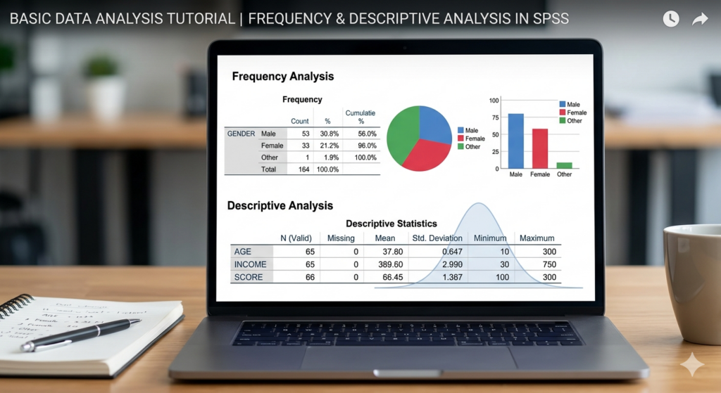
1. Frequency Analysis in SPSS
Frequency analysis is perfect for categorical and demographic variables such as Gender, Age Group, or Level of Study. It gives you a clear breakdown of your sample distribution.
Step-by-Step Guide:
- Navigate to the top menu and click on Analyze > Descriptive Statistics > Frequencies.
- A dialog box will appear. Select the variables you want to analyze (e.g., Gender, Age, Field of Study) from the left and move them to the “Variable(s)” box on the right.
- Charts Option: If you want a visual representation of your data, click on Charts and select either Bar Charts or Pie Charts. You can choose to display the chart values as frequencies (raw numbers) or percentages.
- APA Formatting: When the output is generated, you will see tables showing valid responses and missing values. If you are following APA style for your research, you can easily pull the percentages and raw counts from these SPSS tables to build your finalized tables in Microsoft Word.
- Click OK. Your output viewer will now display your frequency tables alongside any graphs you requested.
2. Descriptive Statistics in SPSS
While frequencies give you counts and percentages, the Descriptives function is used to get a broader numerical summary of your continuous variables.
Step-by-Step Guide:
- Go to Analyze > Descriptive Statistics > Descriptives.
- Select your target variables and move them into the variables box.
- Click on Options. A new dialog box will open where you can check the specific values you need. For fundamental academic reporting, ensure that Mean, Standard Deviation, Minimum, and Maximum are selected.
- Click Continue, then OK.
- SPSS will generate a clean, concise table displaying these values. This output is crucial for understanding the central tendency and the dispersion (how spread out the responses are) of your dataset.
Interpreting Your Results
Once your tables are generated, the next phase is interpretation. You will export these tables and charts to your Word file and write up what the data tells you—for example, explicitly stating the proportion of male versus female participants, or discussing the mean scores of a specific scale.
If you prefer to follow along visually and see exactly where to click on the screen, check out the complete walkthrough in the video below. If you have any questions or get stuck on a step, feel free to drop a comment!
Watch the full tutorial here: